What makes a great HVAC website? People will debate, but there are always certain factors that go into a great lead-generating website. The whole purpose of your website is to bring in leads, so if it’s not it’s time to ask yourself why it’s not working.
The key to having a successful HVAC website has nothing to do with your HVAC expertise but all about how people use your website.We would love to show you one of our many successful HVAC websites. Take a look at our client: Sure-Fire, Inc.
Make It Easy To Request A Quote
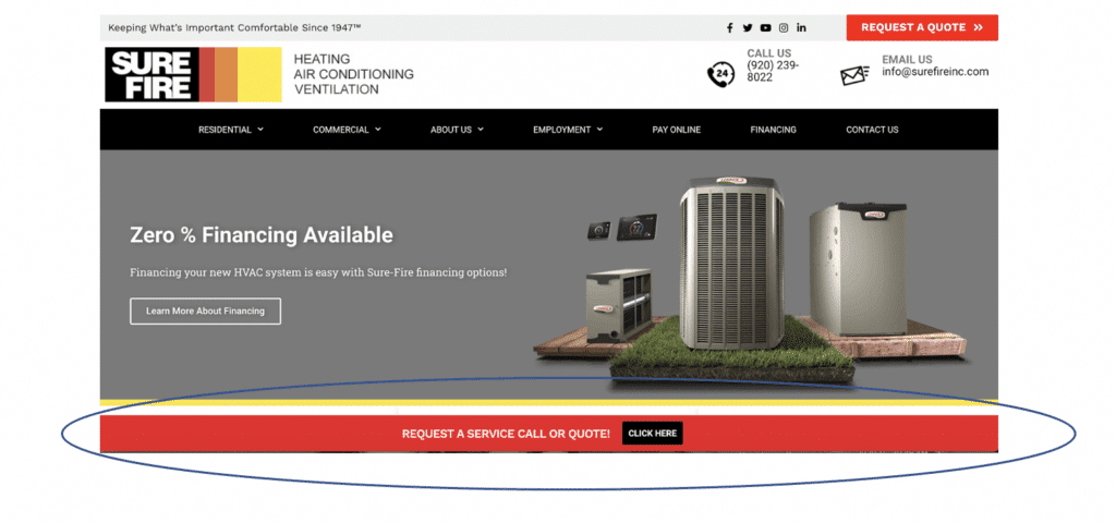
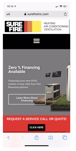
The first thing you notice on both the desktop version and mobile is that the Request a Quote Bar at the bottom stays visible the entire time you are scrolling through. The last thing you want is a client to be scrolling and not find a way to contact you for a quote instantly.
Phone Numbers Need To Be Click-To-Call
The next thing you notice on both the desktop and mobile version is that all the phone numbers are clickable! Customers have a very short attention span and if they are in a hurry you could lose them. If they have to write down your phone number so they can then dial it as opposed to just clicking your phone number anywhere it appears on your website, then they will most likely give up and leave. It’s too much time and effort. Make it really easier for potential customers to just click and call you.
Build Trust With Reviews, Social Media, and Associations
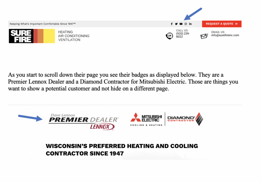
Showing you are trustworthy is an important part of gaining new customers. You can do this with your HVAC website by featuring reviews, badges, and linking both your social media channels and featuring some of the social posts on your website.
Let’s see how we did this with Sure-Fire Inc.
At the very top of the page, you see links to their social media channels. These are important because if someone wants to see what you have been currently doing, they can click on any of your social media icons and it will take them directly to that social channel. It is also important to have this right at the top of your page. It should be easily accessible to them.
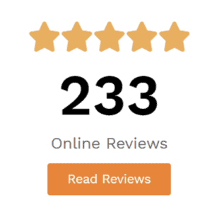
As you keep scrolling you run into their reviews. They have 233 reviews and they are rated 4.6 out of 5 stars. Those are great reviews that you want to feature on your homepage. Again, it’s something that should be easily accessible to your potential customer. You can click read reviews and go right to all the reviews. These three things help customers trust that you know what you are doing in your industry, that you are reliable and that you are trustworthy.
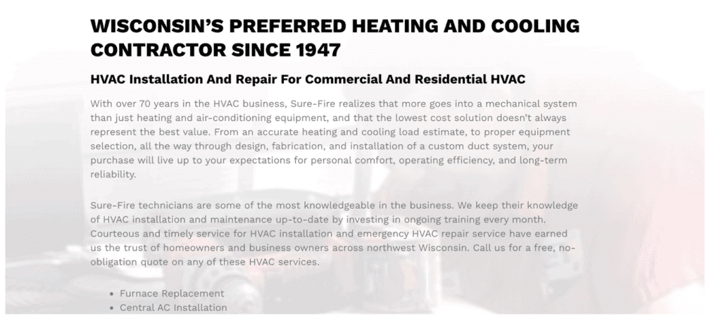
The last thing you want on your homepage is to tell some of your story. You may have an about section that tells an in-depth story but your homepage should give a brief story of who you are and shares your HVAC expertise. Sure-Fire’s website does this in a way that gives you enough information to know that you want to click on their about section and learn more about them.
If your website is missing any or all of these features, then it’s time to revisit your online strategy. Your website should be a tool that easily helps potential customers become actual customers. If you aren’t getting in leads through your website then it is not working for you. Contact us today to talk about how we can help your website work for you!

